这段代码通过 HTML 和 CSS 的结合,创建了一个动态的花朵效果,展示了 CSS 动画和定位的强大功能。
演示效果
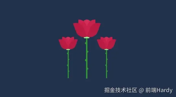
HTML&CSS
1<!DOCTYPE html>
2<html lang="en">
3
4<head>
5 <meta charset="UTF-8">
6 <meta http-equiv="X-UA-Compatible" content="IE=edge">
7 <meta name="viewport" content="width=device-width, initial-scale=1.0">
8 <title>前端Hardy</title>
9 <style>
10 body {
11 background-color: #21324C;
12 color: #fff;
13 font-family: 'Indie Flower', cursive;
14 display: flex;
15 justify-content: center;
16 align-items: center;
17 flex-direction: column;
18 height: 100vh;
19 }
20
21 .text {
22 margin-top: -300px;
23 margin-bottom: 150px;
24 text-align: center;
25 }
26
27 .text h1 {
28 margin: 5px 0;
29 }
30
31 .text h3 {
32 margin: 0;
33 }
34
35 .text a {
36 color: #d52d58;
37 text-decoration: none;
38 }
39
40 .flower {
41 position: relative;
42 top: -80px;
43 left: -20px;
44 }
45
46 .flower:nth-of-type(2) {
47 left: -80px;
48 top: -19px;
49 transform: scale(.7);
50 }
51
52 .flower:nth-of-type(3) {
53 left: 55px;
54 top: -19px;
55 transform: scale(.7);
56 }
57
58 .flower .petal {
59 position: absolute;
60 top: 0;
61 left: 0;
62 background-color: #d52d58;
63 border-radius: 0px 30px 0px 30px;
64 width: 30px;
65 height: 60px;
66 }
67
68 .flower .petal:nth-child(1) {
69 left: -10px;
70 transform: rotate(-10deg);
71 transform-origin: bottom right;
72 background-color: #b81b43;
73 animation: openleft 3s ease-in infinite;
74 z-index: 5;
75 }
76
77 .flower .petal:nth-child(2) {
78 left: -10px;
79 background-color: #c9204b;
80 z-index: 4;
81
82 }
83
84 .flower .petal:nth-child(3) {
85 border-radius: 30px;
86 left: 5px;
87 }
88
89 .flower .petal:nth-child(4) {
90 border-radius: 30px 0px 30px 0px;
91 background-color: #c9204b;
92 left: 20px;
93 z-index: 4;
94 }
95
96 .flower .petal:nth-child(5) {
97 border-radius: 30px 0px 30px 0px;
98 left: 20px;
99 transform: rotate(10deg);
100 transform-origin: bottom left;
101 animation: openright 3s ease-in infinite;
102 background-color: #b81b43;
103 z-index: 5;
104 }
105
106 .flower .rod {
107 background-color: #329932;
108 width: 5px;
109 height: 150px;
110 position: absolute;
111 left: 17.5px;
112 top: 58px;
113 z-index: -1;
114 }
115
116 .flower .rod::before {
117 background-color: lightgreen;
118 border-radius: 3px;
119 content: '';
120 display: block;
121 width: 20px;
122 height: 8px;
123 margin-left: -8px;
124 }
125
126 .flower .rod .spike {
127 width: 0;
128 height: 0;
129 position: absolute;
130 top: 20px;
131 left: -10px;
132 border-color: transparent #329932 transparent transparent;
133 border-style: solid;
134 border-width: 5px;
135 }
136
137 .flower .rod .spike:nth-child(2) {
138 top: 50px;
139 left: 4px;
140 border-color: transparent transparent transparent #329932;
141 }
142
143 .flower .rod .spike:nth-child(3) {
144 top: 80px;
145 }
146
147 .flower .rod .spike:nth-child(4) {
148 top: 110px;
149 left: 4px;
150 border-color: transparent transparent transparent #329932;
151 }
152
153 @keyframes openleft {
154
155 20%,
156 80% {
157 transform: rotate(-20deg);
158 }
159 }
160
161 @keyframes openright {
162
163 20%,
164 80% {
165 transform: rotate(20deg);
166 }
167 }
168 </style>
169</head>
170
171<body>
172 <div class="flower">
173 <div class="petal"></div>
174 <div class="petal"></div>
175 <div class="petal"></div>
176 <div class="petal"></div>
177 <div class="petal"></div>
178 <div class="rod">
179 <div class="spike"></div>
180 <div class="spike"></div>
181 <div class="spike"></div>
182 <div class="spike"></div>
183 </div>
184 </div>
185 <div class="flower">
186 <div class="petal"></div>
187 <div class="petal"></div>
188 <div class="petal"></div>
189 <div class="petal"></div>
190 <div class="petal"></div>
191 <div class="rod">
192 <div class="spike"></div>
193 <div class="spike"></div>
194 <div class="spike"></div>
195 <div class="spike"></div>
196 </div>
197 </div>
198 <div class="flower">
199 <div class="petal"></div>
200 <div class="petal"></div>
201 <div class="petal"></div>
202 <div class="petal"></div>
203 <div class="petal"></div>
204 <div class="rod">
205 <div class="spike"></div>
206 <div class="spike"></div>
207 <div class="spike"></div>
208 <div class="spike"></div>
209 </div>
210 </div>
211</body>
212
213</html>
- .flower 设置花朵的位置和布局。position: relative; 相对定位。top: -80px; 和 left: -20px; 调整花朵的位置。
- .flower .petal 设置花瓣的样式。position: absolute; 绝对定位。background-color: #d52d58; 背景颜色为粉红色。border-radius: 0px 30px 0px 30px; 设置边框圆角。
- .flower .petal 子选择器根据不同的花瓣子元素,设置不同的样式,如旋转角度、背景颜色等。
- .flower .rod 设置花杆的样式。background-color: #329932; 背景颜色为绿色。width: 5px; 宽度为 5px。height: 150px; 高度为 150px。
- .flower .rod::before 设置花杆顶部的装饰。background-color: lightgreen; 背景颜色为浅绿色。
- .flower .rod .spike 设置花杆上的刺。border-color: transparent #329932 transparent transparent; 设置边框颜色,形成三角形的刺。
- @keyframes openleft 和 @keyframes openright 定义关键帧动画,用于创建花瓣的开合效果。
个人笔记记录 2021 ~ 2025