highlight: a11y-dark theme: cyanosis
记录一下在公司遇到的一些功能,以及相关实现
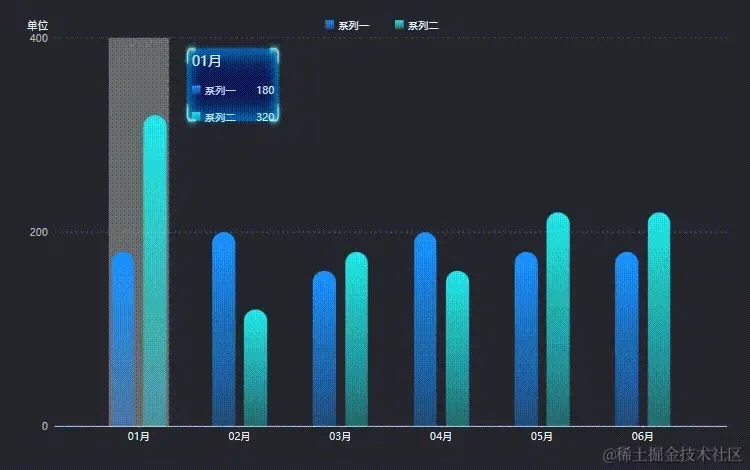
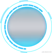
经过之前环形图需求,对ECharts的使用感觉已经非常熟练了,这次写柱状图的时候就快了很多。
在这里还是力推一下这个ECharts图表集,大部分的灵感都来自于这 ^_^
等会讲具体功能的时候,也会将一些具体的案例提供给大家
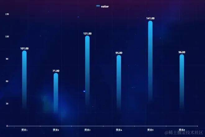
柱状样式
首先,我给大家提供一种柱状图样式,个人感觉不错,而且实现也很简单
看着很酷,实现也很简单,只需要改变一下柱状的color即可,改为渐变色
我取巧,弄了种很简单的方式
1{
2 option.color: [{
3 return {
4 type: 'linear',
5 x: 0,
6 y: 0,
7 x2: 0,
8 y2: 1,
9 colorStops: [
10 {
11 offset: 0,
12 color: '#21B8FA'
13 },
14 {
15 offset: 0.8,
16 color: '#21B8FA' + '00'
17 }
18 ]
19 }
20 }]
21}
可以看到,在颜色后面加00即可,也就是透明度大小,换成另一种形式,大家可能看着更熟悉,
#21B8FA → rgb(33,184,250),而加00就是,#21B8FA00 → rgba(33,184,250, 0)
接下来我们来看具体功能点吧
柱状类型
有个配置项,是设置柱状类型的,有两个选项
- 方形
- 子弹头
效果如下
这个很容易实现,通过配置项即可
属性为:seriesitemStyle.borderRadius
1borderRadius: 5,
2borderRadius: [5, 5, 0, 0]
所以方向很明确了,直接设置为[9999, 9999, 0, 0]即可
最终实现效果
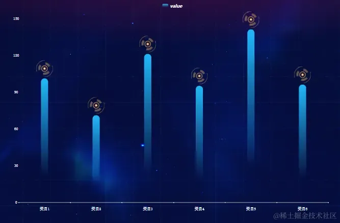
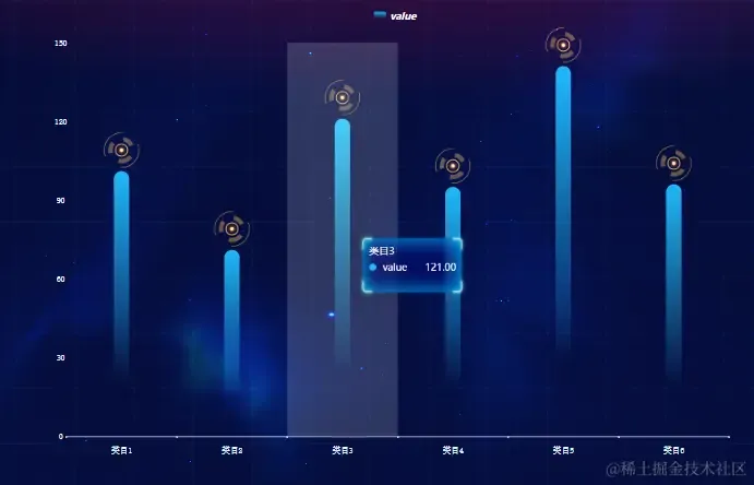
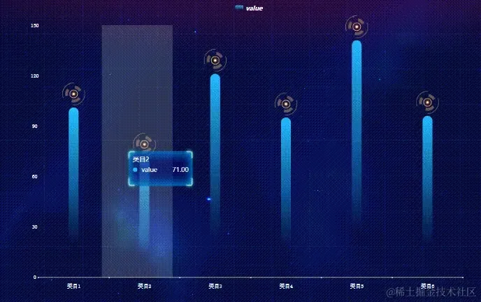
顶部装饰
效果如下
也是有两种实现方式,一种是通过再加一个series去实现,把所有的点换成图片即可
使用的是散点图,我的理解是没有折线的折线图
1 const headDecoratorSeries = {
2 silent: true,
3 animation: false,
4 type: 'scatter',
5 symbol: `image://${url}`,
6 symbolSize: [width, height],
7 symbolOffset: [offsetX, offsetY],
8 label: {
9 show: false
10 },
11 itemStyle: undefined
12 }
然后利用symbolSize和symbolOffset来控制大小和偏移去实现的
另一种方式是通过label的rich属性去实现的,也就是给label添加一个样式,样式里添加背景图片,并控制大小和偏移,具体代码如下
1 seriesItem.label.formatter = '{bg|{c}}'
2 seriesItem.label.rich = {
3 bg: {
4 align: 'center',
5 backgroundColor: {
6 image: url
7 },
8 width: width,
9 height: height,
10 padding: [offsetX, offsetY]
11 }
12 }
为了性能上的取舍,最终选中了用label的rich去实现的
最终实现效果
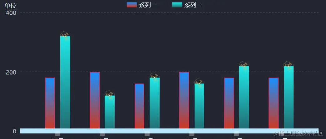
提示框
效果如下
这边的话,主要就是去自定义tooltip的formatter,去自己重新写一个提示框来满足该效果,然后注意系列颜色啥的就好了,其他没啥
我把其中的HTML内容抽离出来
item HTML
1 <div style="display: flex;justify-content: space-between;align-items: center;">
2 <p style="margin: 0;">
3 <span style="display: inline-block;margin-right:5px;width: 10px;height: 10px;border-radius: 50%;background-color: ${param.color.colorStops[0].color}"></span>
4 ${param.seriesName}
5 </p>
6 <span>${param.value}</span>
7 </div>
return HTML
1 <div style="border-radius: 5px;box-shadow: 0 2px 12px 0 rgba(0, 0, 0, 0.1);width: ${width}px;height: ${height}px;transform: translate(${offsetX}px, ${offsetY}px);background: url(url);">
2 <p style="margin: 0; margin-bottom: 2px;font-family: inherit;">
3 ${params[0].axisValueLabel}
4 </p>
5 <div style="display: flex;flex-direction: column;gap: '1px';font-family: inherit;">
6 ${item}
7 </div>
8 </div>
最终内容
1 props.option.tooltip.formatter = params => {
2 const item = params.reduce(
3 (sum, param) =>
4 sum +
5 `
6 <div style='display: flex;justify-content: space-between;align-items: center;'>
7 <p style='margin: 0;'>
8 <span style='display: inline-block;margin-right:5px;width: 10px;height: 10px;border-radius: 50%;background-color: ${param.color.colorStops[0].color}'></span>
9 ${param.seriesName}
10 </p>
11 <span>${param.value}</span>
12 </div>`,
13 ''
14 )
15
16 return `
17 <div style="border-radius: 5px;box-shadow: 0 2px 12px 0 rgba(0, 0, 0, 0.1);
18 width: ${width}px;height: ${height}px;transform: translate(${offsetX}px, ${offsetY}px);
19 background: `url(${url}) 50% 50% / 100% 100% no-repeat`;
20 >
21 <p style='margin: 0; margin-bottom: 2px;font-family: inherit;'>
22 ${params[0].axisValueLabel}
23 </p>
24 <div style="display: flex;flex-direction: column;gap: '1px';font-family: inherit;">
25 ${item}
26 </div>
27 </div>
28 `
29 }
里面包括了设置背景图片、宽高、偏移等功能
最终实现效果
去除提示框自带的阴影效果
首先给tooltip提供一个className
1 option.tooltip.className = 'echarts-tooltip'
然后用CSS样式设置一下即可
1
2 .echarts-tooltip {
3 box-shadow: unset !important;
4 }
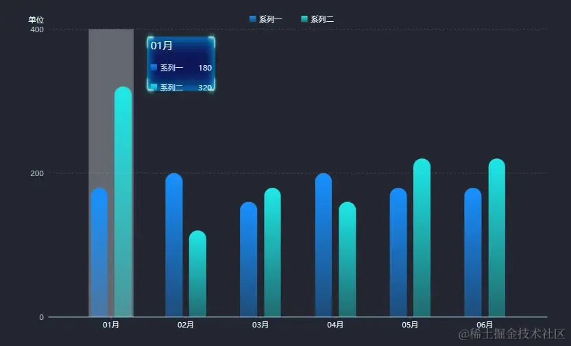
提示框动画
效果如下
如果看过我之前那篇文字的同学,可能会对这里很熟悉,实现的方式是一样的,只是同时多了个显示提示框的功能
这里我就直接附上代码了,有兴趣的可以去看我的上一篇文章
1 const timer = useRef<NodeJS.Timer>()
2 const currentIndex = useRef<number>(0)
3
4 const resetSelect = () => {
5 eChartInstance.current?.dispatchAction({
6 type: 'downplay',
7 seriesIndex: 0
8 })
9 }
10
11 const selectSector = () => {
12 eChartInstance.current?.dispatchAction({
13 type: 'highlight',
14 seriesIndex: 0,
15 dataIndex: currentIndex.current
16 })
17 eChartInstance.current?.dispatchAction({
18 type: 'showTip',
19 seriesIndex: 0,
20 dataIndex: currentIndex.current
21 })
22 }
23
24
25 const rotatingAnimation = () => {
26 if (props.tooltip.isActive) {
27 clearInterval(timer.current)
28 timer.current = setInterval(() => {
29 const dataLen = eChartOption.current?.series[0].data.length ?? 0
30 currentIndex.current = (currentIndex.current + 1) % dataLen
31 resetSelect()
32 selectSector()
33 }, props.tooltip.duration * 1000)
34 } else {
35 resetSelect()
36 }
37 }
38
39 useEffect(() => {
40 rotatingAnimation()
41
42 return () => {
43 clearInterval(timer.current)
44 }
45 }, [props.tooltip])
这边的实现会比环形图简单不少,少了一些功能
最终实现效果
水球图
这次的内容比较少,所以我就把刚做的这个需求也添加到这次的文章里了 ^_^
实现效果
参考案例
看着确实非常酷炫,实现其实也很简单,echarts没有,但有一个这个水球图插件扩展
安装
1 npm install echarts
2 npm install echarts-liquidfill
引入
1 import * as echarts from 'echarts';
2 import 'echarts-liquidfill'
使用
1 option = {
2 backgroundColor: 'transparent',
3 series: [{
4 type: 'liquidFill',
5 radius: '72%',
6 data: [0.6, 0.6, 0.6],
7 backgroundStyle: {
8 color: 'transparent'
9 },
10 label: {
11 show: false
12 },
13 outline: {
14 show: false
15 },
16 color: [convertColor(color)]
17 }]
18 }
其中文字的话,我是额外附加的,放到一个div里面去处理的
还有一个就是背景图片了,需要根据图表位置进行调整和偏移
最终将其抽离为一个组件,遍历3次即可得到该效果
最终实现效果

好了,今天的内容点就到这里啦🎉🎉🎉 ^_^