文章目录
日常开发中,经常会遇到需要展示的文本过长,这种情况下,为了提高用户的使用体验,最常见的处理方式就是把溢出的文本显示成省略号。
处理文本的溢出的方式:1)单行文本溢出; 2)多行文本溢出; 3)超出容器高度缩略展示;4)缩略后加展开收起按钮可点击操作。
一、单行文本溢出省略
1、主要的css属性:
overflow:文字长度超出限定宽度,则隐藏超出的内容
- visible: 默认值。内容不会回修剪,可以呈现在元素框之外。
- scroll: 无论是否超出容器,都会出现一个滚动条。
- auto: 如果没有超出容器的显示,将会正常显示,如果超出,将会出现一个滚动条。
- hidden: 如果内容超出父级容器,超出部分将会被隐藏
text-overflow:规定当文本溢出时,显示省略符号来代表被修剪的文本
- clip:当对象内文本溢出部分裁切掉
- ellipsis:当对象内文本溢出时显示省略标记(…)
注意:只有在设置了overflow:hidden和white-space:nowrap后text-overflow才能够生效的
white-space:控制空白字符的显示,同时还能控制是否自动换行。
- normal: 连续的空白符会被合并,换行符会被当作空白符来处理。
- nowrap:和 normal 一样,连续的空白符会被合并,但文本内的换行无效。
在实现单行文本缩略展示时作用是设置文本不换行,是overflow:hidden和text-overflow:ellipsis生效的基础。 - pre: 连续的空白符会被保留,仅在遇到换行符或 br标签时才会换行。
- pre-wrap: 连续的空白符会被保留。
- pre-line: 连续的空白符会被合并。
word-break: break-all 使一个单词能够在换行时进行拆分。
2、具体实现

1<div class="wrap">
2 <p>单行文本溢出缩略显示</p>
3 <div class="one-line">
4 人们总是把幸福解读为“有”,有房,有车,有钱,有权,但幸福其实是“无”,无忧,无虑,无病,无灾,“有”多半是给别人看的,“无”才是你自的。
5 </div>
6</div>
7
8<style>
9.wrap {
10 width: 350px;
11 margin: 0 auto;
12 text-align: left;
13}
14p {
15 color: #1989fa;
16}
17.one-line {
18 text-overflow: ellipsis;
19 overflow: hidden;
20 word-break: break-all;
21 white-space: nowrap;
22 border: 1px solid #eef0f5;
23}
24</style>二、多行文本溢出省略

1<div class="wrap">
2 <p>两行省略——基于行数截断</p>
3 <div class="two-line">
4 土地是世界上唯一值得你去为之工作,为之战斗,为之牺牲的东西。 Land is the
5 only thing in the world worth working for, worth fighting for, worth dying
6 for.
7 </div>
8</div>
9
10<style>
11.two-line {
12 overflow: hidden;
13 display: -webkit-box; /* 将对象作为弹性伸缩盒子模型显示 */
14 -webkit-line-clamp: 2; /* 行数,值可以改,表示展示X行后多余的缩略展示 */
15 -webkit-box-orient: vertical; /* 设置或检索伸缩盒对象的子元素的排列方式 */
16 word-break: break-all;
17 border: 1px solid #eef0f5;
18}
19</style>三、超过元素宽高省略显示
简单来说,超过元素宽高度后缩略展示,关键在于需要设置元素宽度与高度,然后再根据高度看下最多能放几行,设置-webkit-line-clamp的值为最大行数。

1<div class="wrap">
2 <p>超过元素宽高省略显示</p>
3 <div class="limit-height">
4 现在我发现自己活在一个比死还要痛苦的世界,一个无我容身之处的世界。 Now I
5 find myself in a world which for me is worse than death. A world in which
6 there is no place for me.
7 </div>
8</div>
9
10<style>
11.limit-height {
12 width: 350px;
13 height: 65px;
14 word-break: break-all;
15 overflow: hidden;
16 display: -webkit-box;
17 -webkit-line-clamp: 3;
18 -webkit-box-orient: vertical;
19 border: 1px solid #eef0f5;
20}
21</style>四、纯css实现文本展开 / 收起
1<div class="hide-or-expend">
2 <input id="expend" class="expend" type="checkbox" />
3 <div class="content">
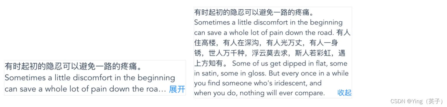
4 <label class="btn" for="expend"></label>
5 有时起初的隐忍可以避免一路的疼痛。 Sometimes a little discomfort in the
6 beginning can save a whole lot of pain down the road.
7 有人住高楼,有人在深沟,有人光万丈,有人一身锈,世人万千种,浮云莫去求,斯人若彩虹,遇上方知有。
8 Some of us get dipped in flat, some in satin, some in gloss. But every
9 once in a while you find someone who's iridescent, and when you do,
10 nothing will ever compare.
11 </div>
12</div>
13
14<style>
15.hide-or-expend {
16 display: flex;
17 width: 350px;
18 margin: 50px auto;
19 overflow: hidden;
20 text-align: left;
21 border: 1px solid #eef0f5;
22}
23.content {
24 position: relative;
25 overflow: hidden;
26 text-overflow: ellipsis;
27 display: -webkit-box;
28 -webkit-line-clamp: 3;
29 -webkit-box-orient: vertical;
30}
31.content::before {
32 content: "";
33 height: calc(100% - 23px);
34 float: right;
35}
36.content::after {
37 position: absolute;
38 content: "";
39 width: 999vw;
40 height: 999vw;
41}
42.btn {
43 float: right;
44 clear: both;
45 color: #1989fa;
46 cursor: pointer;
47}
48.btn::before {
49 content: "展开";
50}
51.expend {
52 display: none;
53}
54.expend:checked + .content {
55 -webkit-line-clamp: 999;
56}
57.expend:checked + .content::after {
58 visibility: hidden;
59}
60.expend:checked + .content .btn::before {
61 content: "收起";
62}
63</style>个人笔记记录 2021 ~ 2025