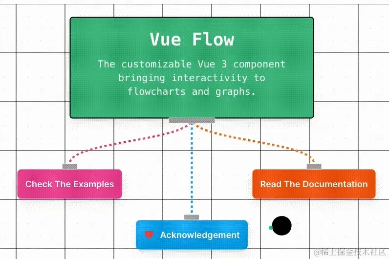
最近,群里在讨论这么一个有趣的交互效果,来源于:vueflow.dev:
通过审查元素,发现原效果借助了 Canvas 实现。
思索了一番,觉得这个效果利用 CSS 配合部分 Javascript 代码完全也是可以做到的。
于是动手尝试了一番,最终完美的复刻了该效果:
过程中还是有非常多有意思的技巧存在的,因此,本文将带大家一起,从 0 到 1 实现这个有趣的交互效果。
利用混合模式实现叠加效果
整个效果,比较核心的一块便是当鼠标 Hover 上去时,整个元素叠加上一层黑色图层,但是呈现了不一样的叠加效果。
这个了解混合模式(mix-blend-mode)的同学应该一下就能想到。
在之前,我们也有多篇文章讲解过混合模式,感兴趣的可以随意快速浏览一下,下面是我写过的 15 篇与混合模式相关的合集链接:
在这里,我们也快速过一下效果中需要用到的混合模式。
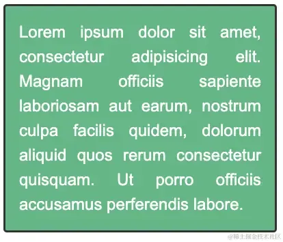
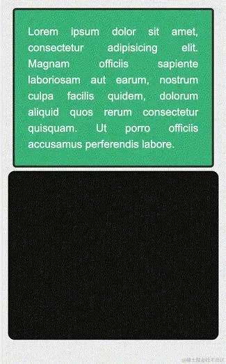
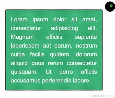
正常而言,假设我们有这么一个 UI 效果:
1<div>Lorem ipsum dolor sit amet, consectetur adipisicing elit.....</div>
1body {
2 background: #eee;
3}
4div {
5 width: 400px;
6 background: #42b983;
7 color: #fff;
8 border: 3px solid #333;
9 border-radius: 5px;
10}
效果如下:
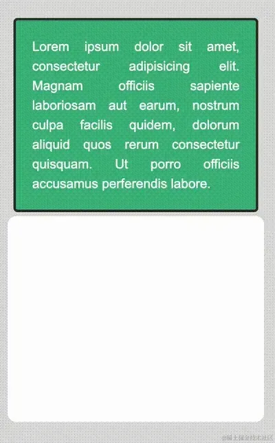
我们利用 div 的伪元素,在其元素本身上叠加一个纯白色块:
1div::before {
2 content: "";
3 position: absolute;
4 inset: -10px;
5 background: #fff;
6 z-index: 1;
7}
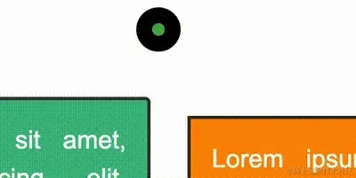
正常而言,由于叠加了一个白色色块在元素之上,肯定是什么都看不到了:
而 CSS 中,混合模式(mix-blend-mode)的作用,就是将多个图层混合得到一个新的效果。
如果,我们给上述效果中的伪元素,添加一个 mix-blend-mode: difference,则会得到如下效果:
1div::before {
2 content: "";
3 position: absolute;
4 inset: -10px;
5 background: #fff;
6 z-index: 1;
7 mix-blend-mode: difference;
8}
效果如下:
其中,混合模式 mix-blend-mode: difference 意为差值模式。该混合模式会查看每个通道中的颜色信息,比较底色和绘图色,用较亮的像素点的像素值减去较暗的像素点的像素值。
与白色混合将使底色反相;与黑色混合则不产生变化。
通俗一点就是上方图层的亮区将下方图层的颜色进行反相,暗区则将颜色正常显示出来,效果与原图像是完全相反的颜色。
并且,由于我们设置了 body 的颜色,所以在动画的一开始,伪元素白色的背景色与 body 的白色通过混合模式叠加直接变成了黑色。
实现鼠标 cursor 动画
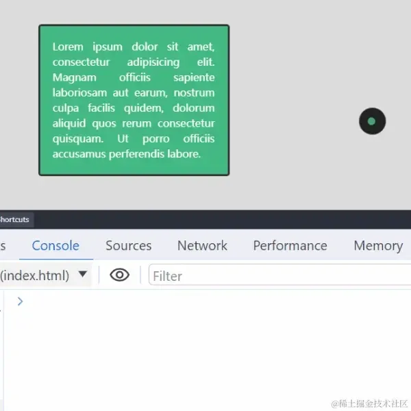
仔细看我们整体要实现的效果,其中鼠标样式与平常不太一样:
接下来,我们就需要实现这么个效果,**把我们的 Curosr 鼠标样式,改成两个小圆点,并且外层圆点的运动带一点延迟效果。
这个也好实现,我们在 有意思的鼠标指针交互探究 中,有实现过一个类似的效果:

修改鼠标样式
首先,第一个问题,我们可以看到,上图中,鼠标指针的样式被修改成了一个圆点:
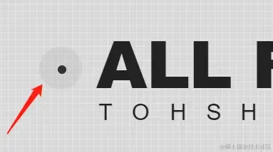
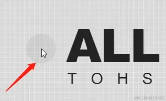
正常而言应该是这样:
如何实现呢?原来在 CSS 中,我们可以通过 cursor 样式,对鼠标指针形状进行修改。
利用 cursor 修改鼠标样式
cursor CSS 属性设置鼠标指针的类型,在鼠标指针悬停在元素上时显示相应样式。
1cursor: auto;
2cursor: pointer;
3...
4cursor: zoom-out;
5
6cursor: url(hand.cur)
7
8cursor: url(hand.cur), pointer;
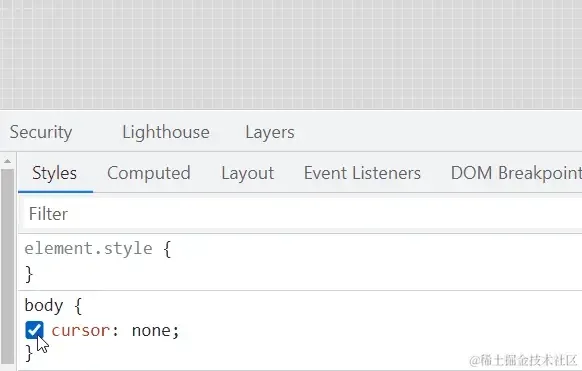
比不过在这里,我们需要通过 cursor: none 隐藏页面的鼠标指针:
1{
2 cursor: none;
3}
如此一来,页面上的鼠标指针就消失了:
通过全局事件监听,模拟鼠标指针
既然,消失了,我们就简单模拟一个鼠标指针。
我们首先实现一个 10px x 10px 的圆形 div,设置为基于 <body> 绝对定位:
1<div id="g-pointer"></div>
1#g-pointer {
2 position: absolute;
3 top: 0;
4 left: 0;
5 width: 10px;
6 height: 10px;
7 background: #000;
8 border-radius: 50%;
9}
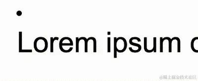
那么,在页面上,我们就得到了一个圆形黑点:
接着,通过事件监听,监听 body 上的 mousemove,将小圆形的位置与实时鼠标指针位置重合:
1const element = document.getElementById("g-pointer");
2const body = document.querySelector("body");
3
4function setPosition(x, y) {
5 element.style.transform = `translate(${x}px, ${y}px)`;
6}
7
8body.addEventListener('mousemove', (e) => {
9 window.requestAnimationFrame(function(){
10 setPosition(e.clientX - 5, e.clientY - 5);
11 });
12});
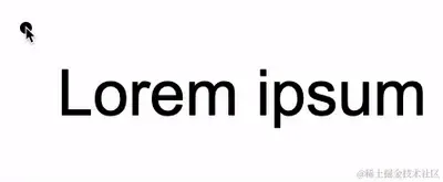
这样,如果不设置 cursor: none,将会是这样一个效果:
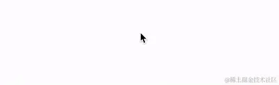
再给 body 加上 cursor: none,就相当于模拟了一个鼠标指针:
在这个基础上,由于现在的鼠标指针,实际上是个 div,因此我们可以给它加上任意的交互效果。
好,我们把上述内容无缝衔接到本效果中,并且,我们其实需要同时模拟两个鼠标,并且让第二个指针的动画,带有一点延迟效果,完整的代码:
1<div id="g-pointer-1"></div>
2<div id="g-pointer-2"></div>
1#g-pointer-1,
2#g-pointer-2 {
3 position: absolute;
4 top: 0;
5 left: 0;
6 width: 12px;
7 height: 12px;
8 background: #999;
9 border-radius: 50%;
10 background-color: #4caf50;
11}
12#g-pointer-2 {
13 width: 42px;
14 height: 42px;
15 background: #fff;
16 transition: .15s ease-out;
17}
1const body = document.querySelector("body");
2const element = document.getElementById("g-pointer-1");
3const element2 = document.getElementById("g-pointer-2");
4const halfAlementWidth = element.offsetWidth / 2;
5const halfAlementWidth2 = element2.offsetWidth / 2;
6
7body.addEventListener("mousemove", (e) => {
8 window.requestAnimationFrame(function () {
9 setPosition(e.clientX, e.clientY);
10 });
11});
12
13function setPosition(x, y) {
14 window.requestAnimationFrame(function () {
15 element.style.transform = `translate(${x - halfAlementWidth}px, ${
16 y - halfAlementWidth
17 }px)`;
18
19 element2.style.transform = `translate(${x - halfAlementWidth2}px, ${
20 y - halfAlementWidth2
21 }px)`;
22 });
23}
这样,我们就完成了页面鼠标样式的改造。不过,有一点需要注意的是,利用模拟的鼠标指针去 Hover 元素,Click 元素的时候,会发现这些事件都无法触发。
这是由于,此时被隐藏的指针下面,其实悬浮的我们模拟鼠标指针,因此,所有的 Hover、Click 事件都触发在了这个元素之上。
当然,这个也非常好解决,我们只需要给模拟指针的元素,添加上 pointer-events: none,阻止默认的鼠标事件,让事件透传即可。
同时,我们也可以给这个模拟鼠标元素,加上一个混合模式。如此一来,我们需要给两个鼠标元素,再加上两个样式:
1#g-pointer-1,
2#g-pointer-2 {
3 // ...
4 mix-blend-mode: exclusion;
5 pointer-events: none;
6}
这样,我们就成功地模拟了新的鼠标样式:
实现完整动画效果
好,基于上述效果铺垫,我们就只剩下一个任务了,如何在 Hover 元素的时候,将鼠标样式外圈,吸附到整个元素之上:
要完成这个动画,必须需要借助 Javascript,通过事件的一些回调完成,总体而言整体思路如下:
- 两个模拟鼠标指针的元素
#g-pointer-1、#g-pointer-2依旧如上面描述的那般,通过<body>的mousemove事件控制,不过在此过程中,额外需要知道是否经过(Hover)了不同的元素 - 通过
mouseover事件监听器,判断当前鼠标是否悬停在我们需要进行吸附扩大动画的的元素上 - 通过
mouseout事件,判断鼠标是否离开目标元素 - 如果鼠标悬停在目标元素上,则计算当前吸附的目标元素的高宽、元素的
border-radius及相对页面右上角的坐标 - 由于模拟的鼠标元素,本身就是绝对定位,因此,可以通过第(3)步的计算,设置模拟的鼠标元素新的高宽及绝对定位坐标,并且其坐标不再随鼠标指针的变化而变化
- 只有当鼠标指针离开目标元素,才复原模拟的鼠标元素的大小,并且让其重新跟随鼠标的移动而移动
本质上而言,通过一句话概括,在整个鼠标元素移动的过程中,如果有悬停到任一元素上,则将外圈鼠标元素 #g-pointer-2 的大小及坐标更改,通过元素的高宽及 border-radius 变化实现视觉上的放大、缩小动画。
首先,通过 mouseover 和 mouseout,我们可以得知我们的鼠标元素,是否悬停在某些特定元素之上,譬如带有 .g-animation 的元素:
1<div class="g-animation">Lorem ...</div>
2
3// 模拟鼠标指针的两个元素
4<div id="g-pointer-1"></div>
5<div id="g-pointer-2"></div>
1window.addEventListener("mouseover", (event) => {
2 const target = event.target;
3
4 if (target.classList.contains("g-animation")) {
5 console.log('mouseover');
6 }
7});
8
9window.addEventListener("mouseout", (event) => {
10 const target = event.target;
11 if (target.classList.contains("g-animation")) {
12 console.log('mouseout');
13 }
14});
15
16
17
这样就能准确知道元素是否悬停在某个目标元素之上:
利用这两种状态,我们就可以继续实现剩余的放大吸附动画。
而放大吸附动画其实也很简单,其核心就是在 mouseover 时,计算出目标元素的坐标及高宽,再设置需要放大的外圈鼠标元素的新的 width、height、border-radius、transform。同时,让其不再跟随真实的鼠标运动而运动。
在 mouseout 时,复原外圈鼠标元素的大小及恢复其跟随真实的鼠标运动而运动。
如此一来,整个效果的完整的代码如下:
1// 代表了页面不同的可以吸附的元素,它们的高宽、border-radius 各不相同
2<div class="g-animation">Lorem ...</div>
3<div class="g-animation">Lorem ...</div>
4<div class="g-animation">Lorem ...</div>
5
6// 模拟鼠标指针的两个元素
7<div id="g-pointer-1"></div>
8<div id="g-pointer-2"></div>
1body {
2 background: #fff;
3 cursor: none;
4}
5
6#g-pointer-1,
7#g-pointer-2
8{
9 position: absolute;
10 top: 0;
11 left: 0;
12 width: 12px;
13 height: 12px;
14 background: #999;
15 border-radius: 50%;
16 background-color: #4caf50;
17 z-index: 1;
18 mix-blend-mode: exclusion;
19 pointer-events: none;
20}
21#g-pointer-2 {
22 width: 42px;
23 height: 42px;
24 background: #fff;
25 transition: .15s ease-out;
26}
1const body = document.querySelector("body");
2const element = document.getElementById("g-pointer-1");
3const element2 = document.getElementById("g-pointer-2");
4const halfAlementWidth = element.offsetWidth / 2;
5const halfAlementWidth2 = element2.offsetWidth / 2;
6
7
8let isHovering = false;
9
10
11window.addEventListener("mouseover", (event) => {
12 const target = event.target;
13
14 if (target.classList.contains("g-animation")) {
15 isHovering = true;
16
17 const rect = target.getBoundingClientRect();
18 const style = window.getComputedStyle(target);
19
20 element2.style.width = `${rect.width + 20}px`;
21 element2.style.height = `${rect.height + 20}px`;
22 element2.style.borderRadius = `${style.borderRadius}`;
23 element2.style.transform = `translate(${rect.left - 10}px, ${
24 rect.top - 10
25 }px)`;
26 }
27});
28
29
30window.addEventListener("mouseout", (event) => {
31 const target = event.target;
32 if (target.classList.contains("g-animation")) {
33 isHovering = false;
34
35
36 element2.style.width = `42px`;
37 element2.style.height = `42px`;
38 element2.style.borderRadius = `50%`;
39 }
40});
41
42
43body.addEventListener("mousemove", (e) => {
44 window.requestAnimationFrame(function () {
45 setPosition(e.clientX, e.clientY);
46 });
47});
48
49function setPosition(x, y) {
50 window.requestAnimationFrame(function () {
51 element.style.transform = `translate(${x - halfAlementWidth}px, ${
52 y - halfAlementWidth
53 }px)`;
54
55 if (!isHovering) {
56 element2.style.transform = `translate(${x - halfAlementWidth2}px, ${
57 y - halfAlementWidth2
58 }px)`;
59 }
60 });
61}
如此一来,页面上任意带有 .g-animation 的元素,都可以允许模拟鼠标的元素进行吸附动画。
我们也就实现了文章最开头的动画效果:
完整的代码很少,你可以戳这里看完整的代码及效果展示:CodePen Demo — Cursor Hover Animation Demo