通过两个半个胶囊组合而成,分别控制颜色及圆角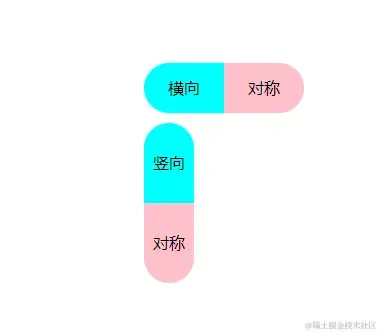
1<body>
2 <div class="app">
3 <div class="box">
4 <div class="box-1 horizontal">横向</div>
5 <div class="box-2 horizontal">对称</div>
6 </div>
7 <div class="box2">
8 <div class="box-11 vertical">竖向</div>
9 <div class="box-22 vertical">对称</div>
10 </div>
11 </div>
12</body>
13<style>
14 .app {
15 padding: 200px;
16 }
17
18
19 .box {
20 display: flex;
21 margin-bottom: 10px;
22 }
23
24 .horizontal {
25 width: 80px;
26 height: 50px;
27 line-height: 50px;
28 text-align: center;
29 background-color: aqua;
30 }
31
32 .box-1 {
33
34 border-radius: 25px 0 0 25px;
35 }
36
37 .box-2 {
38
39 border-radius: 0 25px 25px 0;
40 background-color: pink;
41 }
42
43
44 .vertical {
45 width: 50px;
46 height: 80px;
47 line-height: 80px;
48 text-align: center;
49 background-color: aqua;
50 }
51
52 .box-11 {
53
54 border-radius: 25px 25px 0 0;
55 }
56
57 .box-22 {
58
59 border-radius: 0 0 25px 25px;
60 background-color: pink;
61 }
62</style>
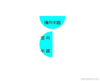
设置一个长方形,长为宽的二倍
1<body>
2 <div class="app">
3 <div class="horizontal">横向半圆</div>
4 <div class="vertical">竖向半圆</div>
5 </div>
6</body>
7<style>
8 .app {
9 padding: 200px;
10 }
11 .horizontal {
12 width: 100px;
13 height: 50px;
14 line-height: 50px;
15 background: aqua;
16 border-radius: 0 0 50px 50px;
17 text-align: center;
18 margin-bottom: 10px;
19 }
20 .vertical {
21 width: 50px;
22 height: 100px;
23 line-height: 50px;
24 background: aqua;
25 text-align: center;
26 border-radius: 50px 0 0 50px;
27 letter-spacing: 5px;
28 }
29</style>
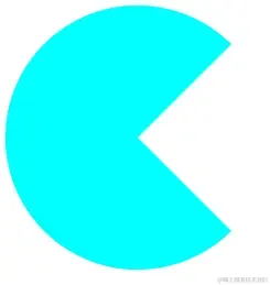
通过某一个角的圆角角度,实现扇形,不同方向还可以搭配旋转实现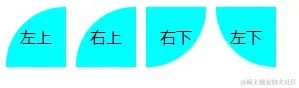
1<body>
2 <div class="box">
3 <div class="toprt-sector">左上</div>
4 <div class="toplf-sector">右上</div>
5 <div class="botlf-sector">右下</div>
6 <div class="botrt-sector">左下</div>
7 </div>
8</body>
9<style>
10 .box{
11 display: flex;
12 }
13 .toplf-sector,
14 .toprt-sector,
15 .botlf-sector,
16 .botrt-sector {
17 width: 60px;
18 height: 60px;
19 background: aqua;
20 line-height: 60px;
21 text-align: center;
22 margin-right: 10px;
23 }
24 .toprt-sector {
25 border-radius: 60px 0 0 0;
26 }
27 .toplf-sector {
28 border-radius: 0 60px 0 0;
29 }
30 .botlf-sector {
31 border-radius: 0 0 60px 0;
32 }
33 .botrt-sector {
34 border-radius: 0 0 0 60px;
35 }
36</style>
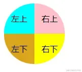
四个盒子组合实现
- 通过四个盒子分别设置圆角组合实现
1<body>
2 <div class="box">
3 <div class="toprt-sector">左上</div>
4 <div class="toplf-sector">右上</div>
5 <div class="botrt-sector">左下</div>
6 <div class="botlf-sector">右下</div>
7 </div>
8</body>
9<style>
10 .box{
11 display: flex;
12 flex-wrap: wrap;
13 width: 120px;
14 }
15 .toplf-sector,
16 .toprt-sector,
17 .botlf-sector,
18 .botrt-sector {
19 width: 60px;
20 height: 60px;
21 background: aqua;
22 line-height: 60px;
23 text-align: center;
24 }
25 .toprt-sector {
26 border-radius: 60px 0 0 0;
27 }
28 .toplf-sector {
29 border-radius: 0 60px 0 0;
30 background-color: pink;
31 }
32 .botlf-sector {
33 border-radius: 0 0 60px 0;
34 background-color: yellow;
35 }
36 .botrt-sector {
37 border-radius: 0 0 0 60px;
38 background-color: goldenrod;
39 }
40</style>
一个盒子实现
- 通过一个盒子的四个边框圆角实现,可以搭配旋转使用
1<body>
2 <div class="box">
3 </div>
4</body>
5<style>
6 .box{
7 width: 0;
8 height: 0;
9 border-radius: 50%;
10 border: 120px solid;
11 border-left-color: pink;
12 border-right-color: yellow;
13 border-top-color: gold;
14 border-bottom-color: aqua;
15 transform: rotate(45deg);
16 }
17</style>
通过某一角度边框透明实现,也可以通过四个盒子组合,某一个盒子设置透明
1<body>
2 <div class="box">
3 </div>
4</body>
5<style>
6 .box{
7 width: 0;
8 height: 0;
9 border-radius: 50%;
10 border: 120px solid aqua;
11 border-right-color: rgba(255, 255, 0, 0);
12 }
13</style>
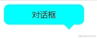
通过伪元素加定位实现与Y轴偏移实现,宽高设为0,其中一个边框有色,其他透明色
1<body>
2 <div class="box">对话框</div>
3</body>
4<style>
5 .box{
6 width: 160px;
7 height: 40px;
8 line-height: 40px;
9 text-align: center;
10 border-radius: 10px;
11 background-color: aqua;
12 position: relative;
13 }
14 .box::after{
15 content: '';
16 width: 0;
17 height: 0;
18 position: absolute;
19 bottom: 0;
20 right: 20px;
21 transform: translateY(20px);
22 border: 10px solid aqua;
23 border-bottom-color: transparent;
24 border-right-color: transparent;
25 border-left-color: transparent;
26 }
27</style>
伪元素实现
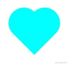
旋转正方形为菱形,两个伪元素分别控制两边半圆部分,随后通过定位调整位置
1<body>
2 <div class="box">
3 <div class="love"></div>
4 </div>
5</body>
6<style>
7 .box{
8 padding: 200px;
9 }
10 .love {
11 width: 100px;
12 height: 100px;
13 background: aqua;
14 position: relative;
15 transform: rotate(45deg);
16 }
17 .love::before,
18 .love:after {
19 content: "";
20 background: aqua;
21 position: absolute;
22 display: inline-block;
23 }
24 .love:after {
25 width: 50px;
26 height: 100px;
27 border-radius: 50px 0 0 50px;
28 right: 99px;
29 top: 0;
30 }
31 .love::before {
32 width: 100px;
33 height: 50px;
34 border-radius: 50px 50px 0 0;
35 bottom: 99px;
36 left: 0;
37 }
38</style>
三盒子实现
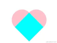
旋转正方形为菱形,两个盒子分别控制两边半圆部分,随后通过定位调整位置
1<body>
2 <div class="box">
3 <div class="love">
4 <div class="loveLeft"></div>
5 <div class="loveRight"></div>
6 </div>
7 </div>
8</body>
9<style>
10 .box {
11 padding: 200px;
12 }
13 .love {
14 width: 80px;
15 height: 80px;
16 background: aqua;
17 transform: rotate(45deg);
18 position: relative;
19 }
20 .loveLeft,
21 .loveRight {
22 position: absolute;
23 background-color: pink;
24 }
25 .loveLeft {
26 width: 40px;
27 height: 80px;
28 left: -40px;
29 top: 0;
30 border-radius: 40px 0 0 40px;
31 }
32 .loveRight {
33 width: 80px;
34 height: 40px;
35 right: 0;
36 top: -40px;
37 border-radius: 40px 40px 0 0;
38 }
39</style>
个人笔记记录 2021 ~ 2025